
Are winners recording higher ratings at events with more players?
June 5, 2019 by Aaron Howard in Analysis with comments

As we move into the dog days of the touring season, it’s easy to think that 2019 is just like any other year of disc golf. In some ways it is. Heck, we just finished the 34th consecutive Masters Cup! But in other ways, things have changed.
One of the biggest changes at big tournaments is field size (number of players).1 Below is a plot showing how field size has changed for four of the largest tournaments. I split each tournament into two bins: a small field size bin and a large field size bin. These bins correlate with time, so you can see that from around 2015 to 2017, field sizes got a lot bigger and have remained that way.
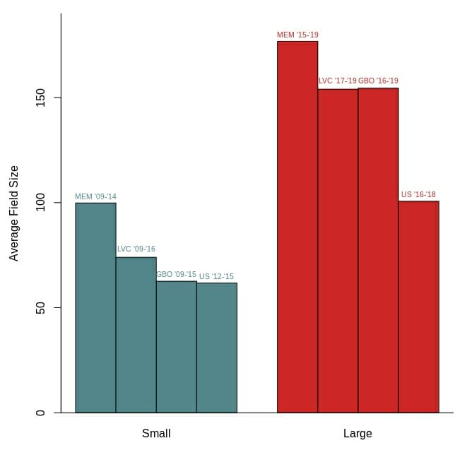
Look at the GBO, for example. In 2016 the MPO field was 91 players. But in 2017, it leaped up to 150 and has not dropped below 141 since. The Las Vegas Challenge2 had a field size of 76 in 2016, and then it skyrocketed to 151 in 2017. I won’t go through all the tournaments, but the general pattern is the same.
The goal of this article is not to discuss how or why field size has increased, though that would be an interesting article and someone should write it! The goal of this article is to examine the consequences of this increase in field size on tournament results.
The tournament results I am going to focus on are round ratings, because they are what precipitate this analysis. On The Upshot back in April my esteemed colleague, Jamie Thomas, made the observation that competitors were winning events by performing well above their player ratings. For example, at the Memorial Championship Eagle McMahon averaged 1078-rated golf, even though his player rating was only 1046 at the time. In other words, he averaged 32 points over his player rating.
In the same episode of The Upshot, I posited that the increase in field size could explain why we are seeing high average round ratings by winners like Eagle McMahon. More specifically, with more competitors the frequency of all possible performance outcomes increases. More players will play below their ratings, more will play at their ratings and, most importantly for this article, more will play above their ratings.
The plot below shows this pattern pretty clearly. It is displaying the distribution of differences between player ratings and their average round ratings for tournaments with large fields and small fields. I know that sounds like a confusing statement at first, but it isn’t. Just think back to the McMahon example. His average of 32 points above his player rating at the Memorial is one of the data points on that plot for tournaments with large fields. So is the 23 points above-his-rating performance of Calvin Heimburg at the 2019 Las Vegas Challenge.
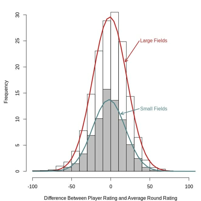
The distributions for large and small fields have similar shapes (they are both the normal, bell-shaped curves), but the distribution for large fields is taller pretty much across the board. It is showing how large fields have a greater frequency of all possible outcomes, including competitors with average round ratings above their player ratings.
One way to interpret these distributions is that players will have to shoot especially well if they want a high finish in a tournament with a lot of competitors. Along those same lines, they support my hypothesis that field size is causing the apparent increase in the average round ratings of winners.
I need to test this hypothesis more directly. To do that, I used a re-sampling simulation method to determine what the difference between player ratings and average round ratings would look like under the influence of only field size.3 Then I compared those simulated values to the actual values for winners, and top five through top 50 finishers.
The results, in the plot below, are extremely interesting, but need a little further explanation. The lines in the plot do not just show the differences between player ratings and average round ratings for the simulated and actual data, but they show how those differences differ for small and large field tournaments.
Again, this may sound confusing, but it is fairly simple. The simulated results show that, across the board, players in the top 50 are expected to average about 6.5 points more above their rating in large field tournaments than low field tournaments. This is pretty close to what the actual data show. Top 50 players in the large fields have averaged 7.3 points more above their ratings than those in low fields. This is consistent with the logic I described above: large fields mean players have to shoot well to finish well.
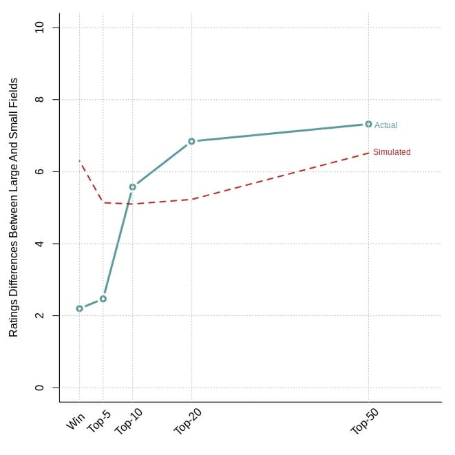
The results for top 50, top 20, and top 10 finishes seem to support the field size hypothesis. Of the difference between large and small fields, 85.6% can be explained by field size, or more informally, the lines for the simulated and actual data are very close to each other.
But as you can see, the pattern seems to break down when we get into the top five. Quite surprisingly, the actual data indicate that winners and top five finishers are not playing that much more above their ratings in large field versus small field tournaments. In large field tournaments, winners are only shooting 2.2 points more above their ratings than winners of small field tournaments. Anecdotally, this pattern is no more apparent than with the Memorial, where winners from the small fields (‘09-’14) outstripped their player ratings by an average of 26.9 points, whereas winners from the large field events (‘15-’19) did so by only 23 points.
This result is very different than those from the simulation. What could be causing this difference? One possibility is that our sample size is too low (though 40 tournaments does sound like a pretty good size). Another possibility is that winners aren’t actually playing as well as the field size hypothesis would suggest. Or it could be a combination of both possibilities.
The results could also point to a gap between the haves (highly rated players) and the have-nots (lower rated players). Perhaps many of the competitors that finish in the top 50 or top 20 are those that have relatively lower player ratings, but had a good tournament (aka, shot above their ratings). But once you get into the top five, you are (on average) only seeing the highest rated players, whether or not they perform above their ratings.
This pattern is somewhat supported in the simulated results, where the top five value is lower than the winner value. Many of those top five finishers may be top echelon players that are performing at or near their player ratings, which is good enough for the podium but not for the win.
In conclusion, it is pretty clear that field size is influencing a lot of the patterns we are seeing in top 10, 20 and 50 finishers. However, the jury is still out for winners and top five finishers.

